
Android & iOs App
Product Design
Design System
User Research
Wireframes
Saas Product


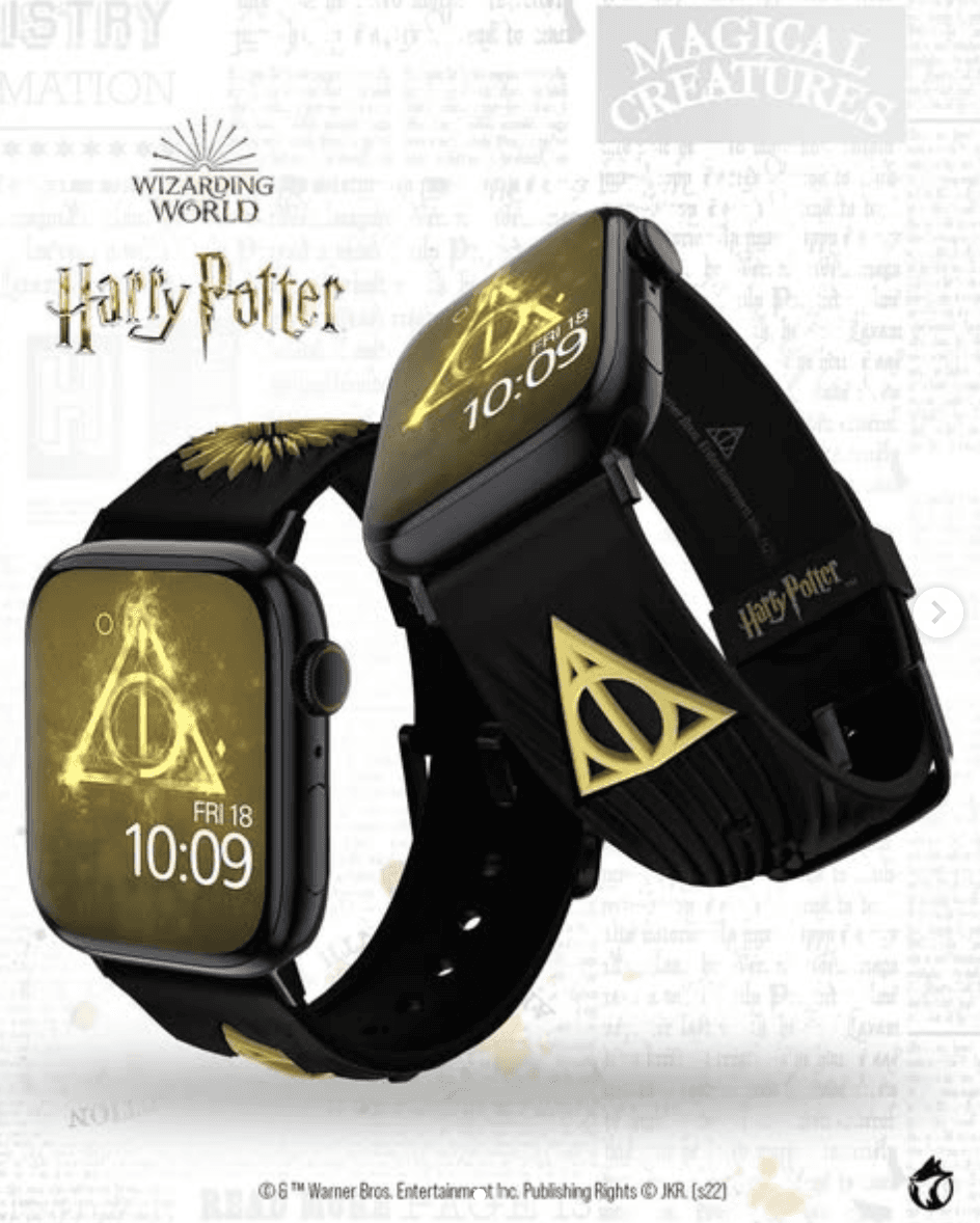
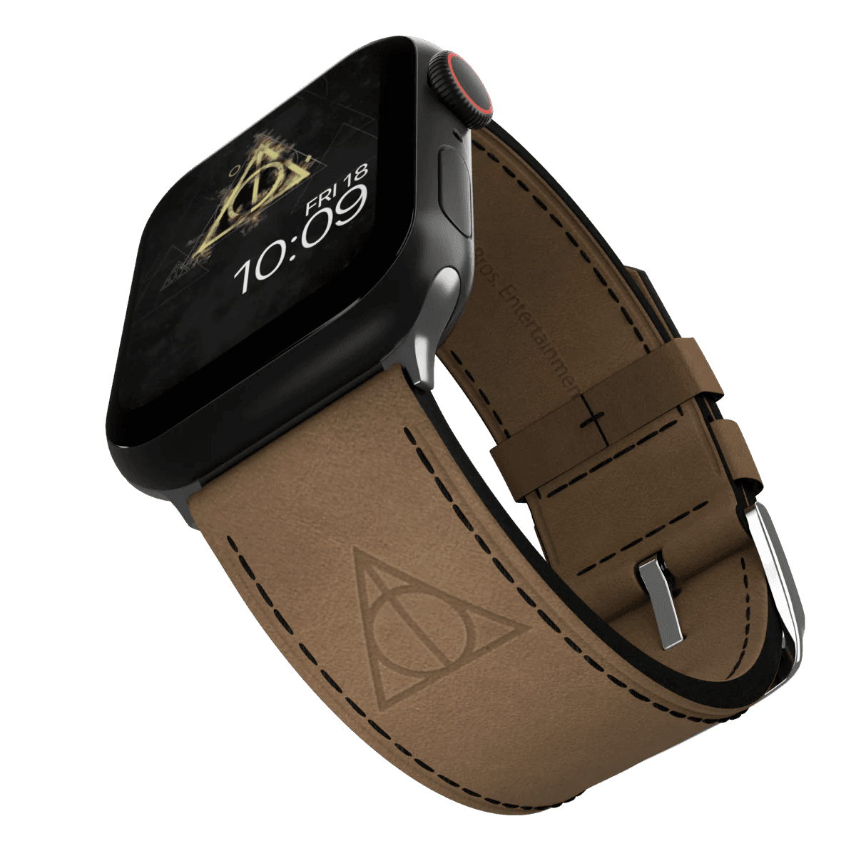
MobyFox is a brand known for its officially licensed smartwatch bands and digital watch faces. Their app, MobyFace, lets users browse and install thousands of watch faces from popular franchises like Harry Potter, Netflix, and Riot Games.
I crafted the new digital brand identity and scalable design system for iOS and Android MobyFox Apps.
As well as designed and prototyped of all new user flows, delivering high-fidelity UIs for all screens.
Team
Worked with the Director of Digital Product and a cross-functional team of 7 devs, data analysts, and key stakeholders aligning design with business goals.
Timeline
Disclaimer
The company filed for bankruptcy before the 2024 launch. We tested key features on the legacy app, showing strong early engagement, but the shutdown came sooner than expected.


For Context
Initially, the primary function of the applications was for users to scan a QR code available in the box of the physical product bought to be able to download free watch-faces / wallpapers.
Creating Personas
I - Quantitative metrics from our user's behaviours
We leveraged user and purchase data we had, by December 2022, to guide features and shape a vision tailored to similar profiles, while creating personas to understand current users and assess their potential to convert from free to paying customers.
71,377
iOs App* downloads solely from the United States of America (who are also 74% of our total buyers).
19%
of the iOs total annual downloads in 2022 was Christmas-time, followed by 7.5% for Black Friday.
*The Android App was only launched in February 2023.


II - Out of the box customer insights
Customer service offered valuable insights into our personas through direct user interactions.
Interesting Fact
These watch bands are frequently bought by parents for their children.
Analysis
A portion of our target audience falls below the age data we can legally collect, as users must be over 13 to use the app or shop online.
Additionally
Parents reached out to share their kids’ experiences, request new collections, and ask about app features.
III- Personas


Strategic Approach
To validate our ideas before investing in a full redesign AND introduction of new features, we did the following:
I - Market and seasonal research:
Analyzed competitors' sales models (subscriptions vs one-offs)
Identified download trends from app stores and shopify to plan when to launch collection
Data and insight were used to shape content themes and push notifications
II - Testing two new monetization models*

In-app purchases for digital watch face bundles (iOs and Android)

Weekly subscription to time-limited collections tied to holidays and fan events (iOs)
*Teasers of features adapted to the new UI I designed
III - KPIs and insights
Conversion Rate: number of new subscriptions and sale after each release

Subscription Engagement: with weekly content (activation, cancellations, renewals)

User Segmentation: Free-only, Paid-only, Transitioned users from free to paid

Quick Measurable Success
Even though the new UI never saw the day on Google Play and the Apple Store we were able to know that our approach towards monetization was on the right path.
Features that were added to the legacy app gave us the following data and numbers
In-App purchase collections
13%
of our users have purchased at least 1 in-app collection
$44,700
Weekly Subscription
(Launched October 1st)
65
(14%) organic individual acquired subscriptions in the first month post-launch
$165.17
has been generated organically in the first 2 months post-launch
Seeing users engage with in-app purchases inspired several new feature ideas that, while never tested, we believe would have resonated well with our audience:

Bundle of collections from the same umbrella brand. Think everything under the DC Universe in one big collection of collections!

Premium subscription for users that will exclusive collections to brands they are fan of and that free users on the app will not even know about them

“Time-bomb” products like limited-time or limited-quantity watch faces, paired with previews of upcoming drops to build anticipation.
Wireframes

UI Sheet Sneak Peek

UI screens


